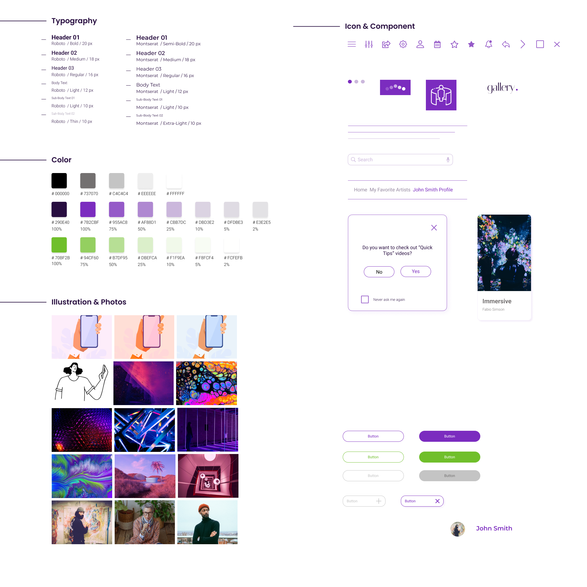
Virtual Tour App for an Art Gallery
UX Design | Mobile App
The Gallery offers a modern way of displaying art by its virtual tour. Art enthusiasts can visit their favorite artists' exhibitions and explore immersive exhibits.
August 2021 - November 2021
Busy art enthusiasts miss the opportunity to keep their hobbies.
Design a virtual app for an art gallery. Help art enthusiasts, artists and galleries stay connected anywhere and anytime.
UX designer. I led and designed a Virtual Tour App for an Art Gallery, from conception to delivery.
I Conducted interviews, paper and digital wireframing, and low and high-fidelity prototyping. I also conducted usability studies, accounted for accessibility, and iterated on designs.
I started with research. Then I conducted interviews and created empathy maps to understand the users. The empathy maps helped me find user pain points. The research identified a primary user group as individuals with busy schedules. This user group confirmed initial assumptions about the Gallery visitors. In addition, the study revealed financial difficulties, lack of information, and commute were other user problems.
Busy individuals don't have time to keep their hobbies.
Busy individuals have financial concerns that come along their way.
Coordinating a visit to an art gallery is challenging for busy adults with a child.
The quality of exhibits and arts doesn't meet an individual's expectations.
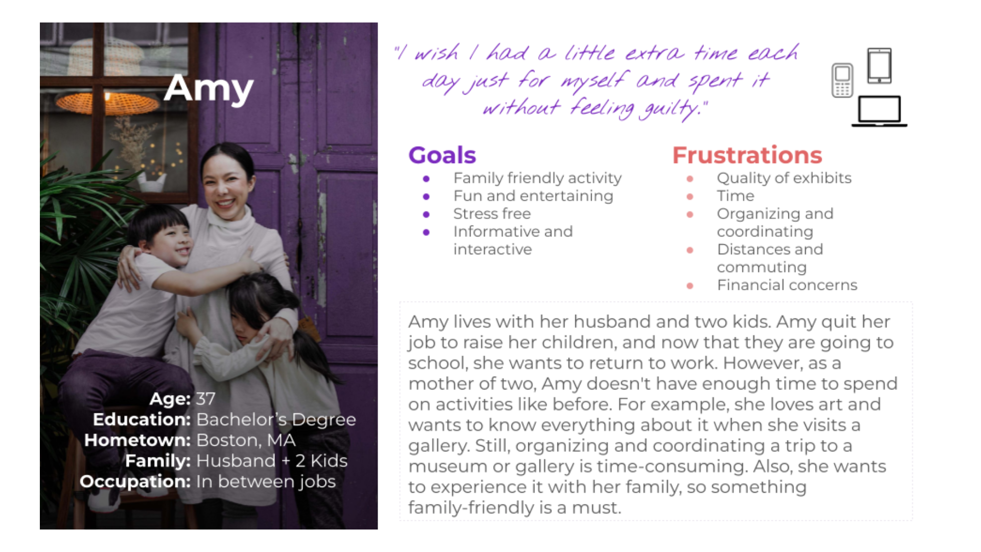
As a busy full-time mom of two kids and a Wife, I want to have worry less, activities so that I Enjoy the time with my family and keep some of my old hobbies.
Amy is a mother of two children who need to keep their fun and stress-free hobby because she feels isolated, lonely, and away from her interests.
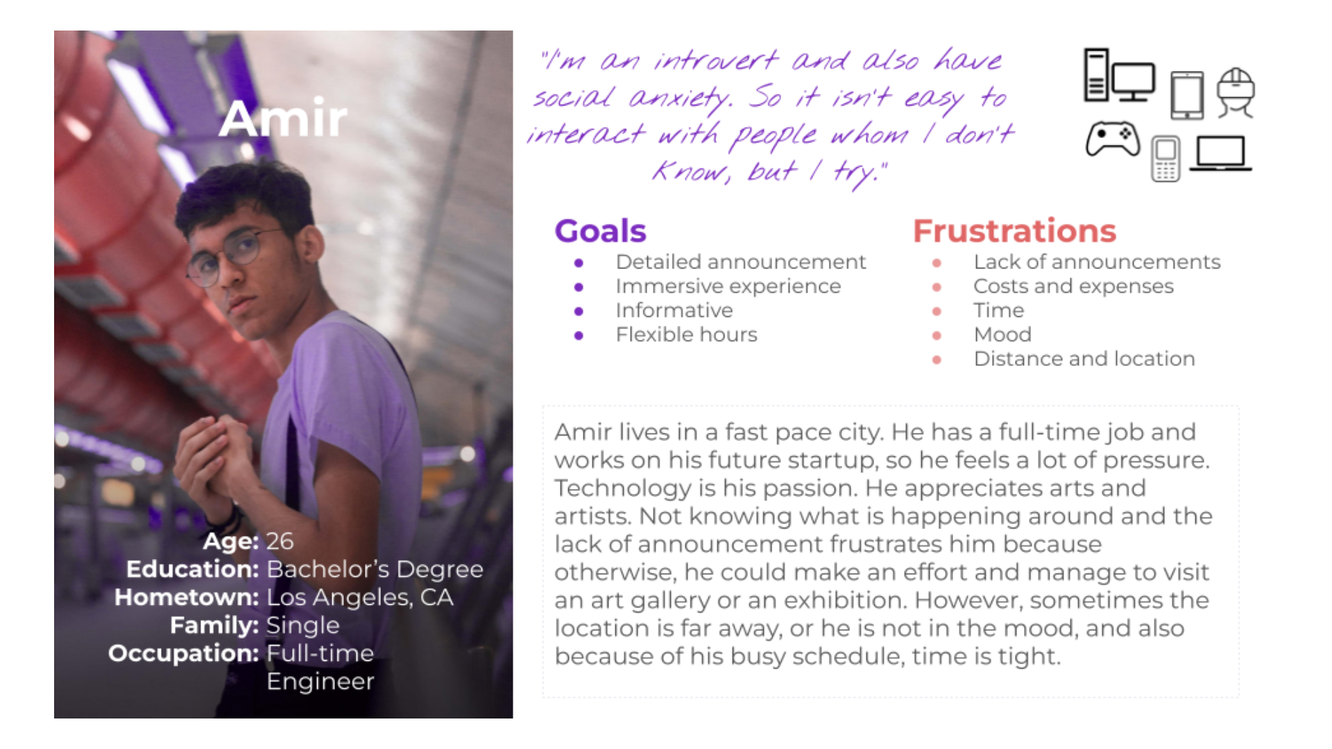
As a busy professional, I want to get information about new exhibits with flexible hours so that I engage with something that I admire other than work.
Amir is a busy engineer who needs detailed information about their hobby because they want to have something engaging and fun other than work with flexible hours.
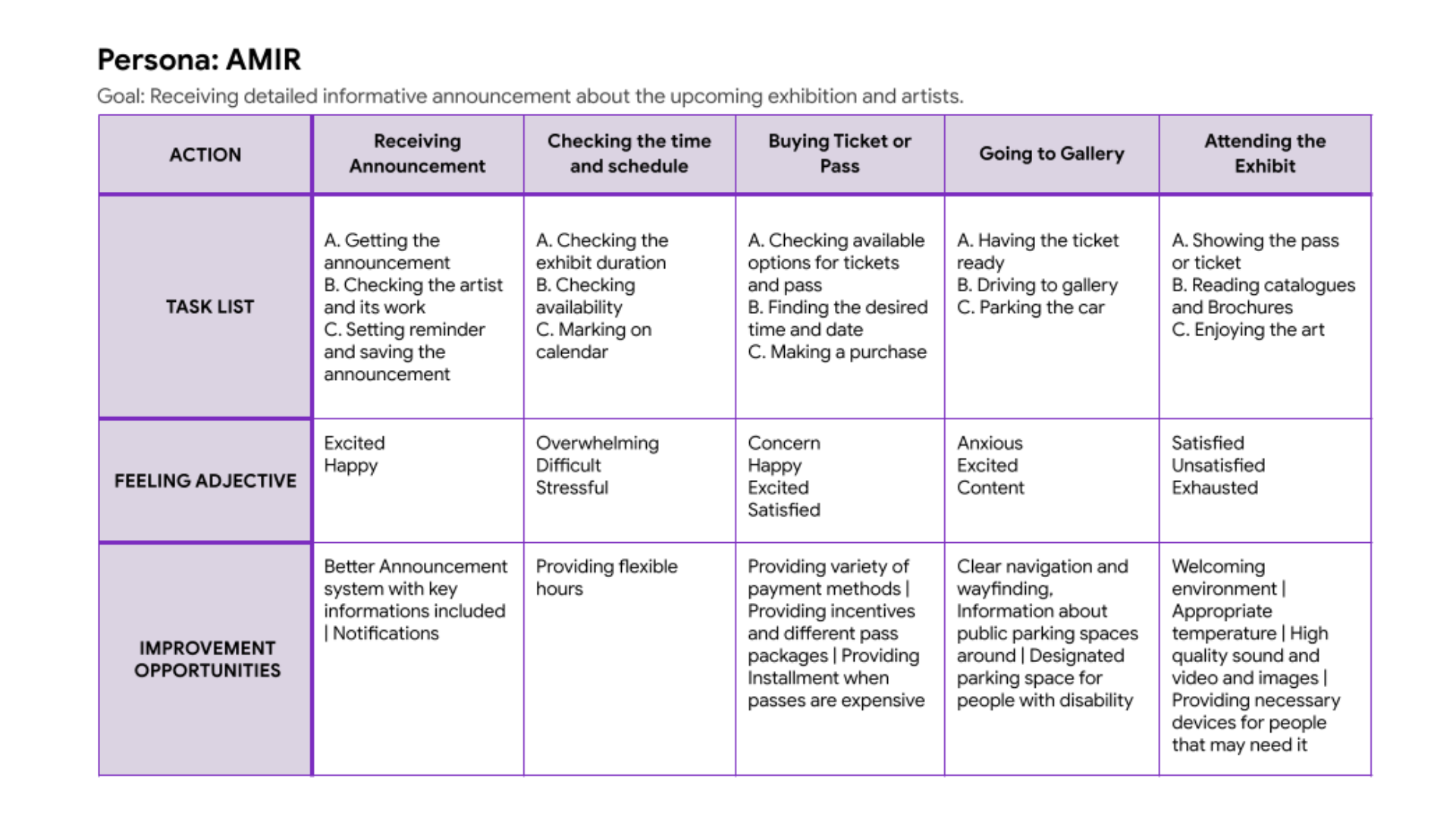
I created user journey map for my personas. Amir's user journey map shows us how helpful it would be to create an app for a gallery that offers virtual tours.
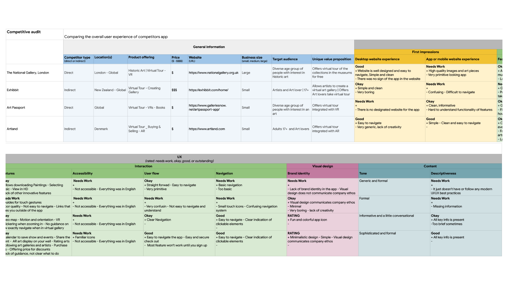
An audit of a few competitors' products provided direction on gaps and opportunities to address with the Virtual Tour App.
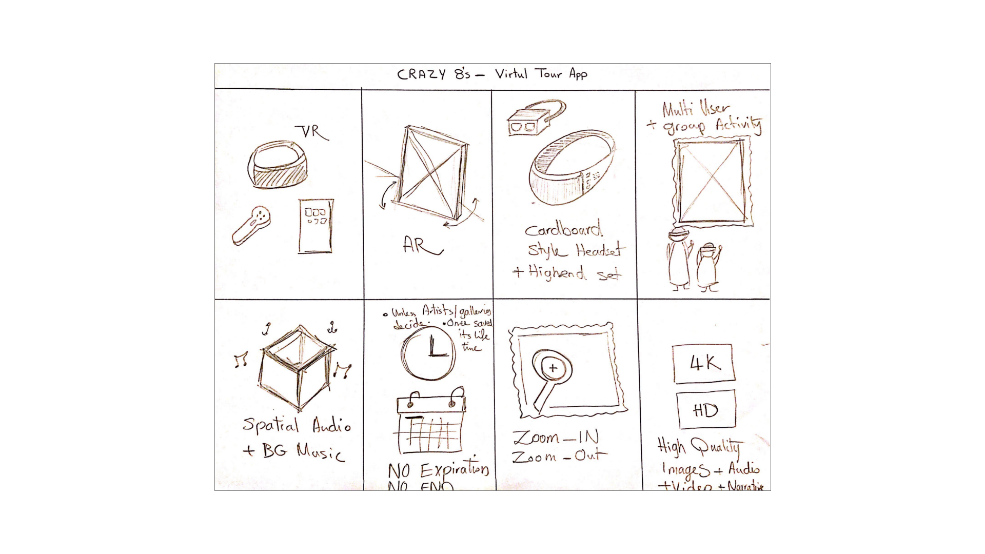
I used the Crazy 8s method to develop ideas for addressing gaps identified in the competitive audit alongside the users' needs. My focus was explicitly finding a way to make the experience splendid based on the opportunities found after the competitive audit.
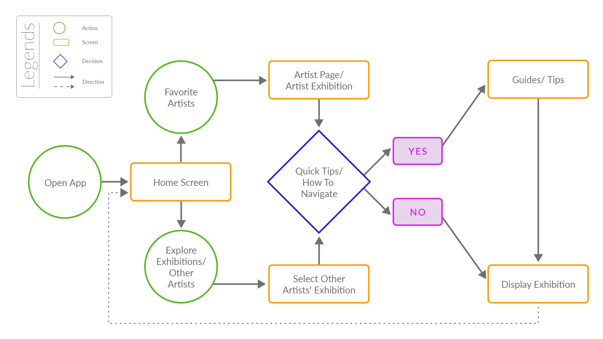
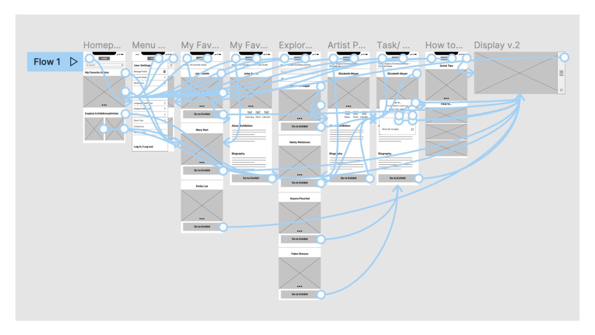
The user flow demonstrates how users complete the task from the starting point. [This flow is for a user who already is a member and does not need to sign in or sign up]
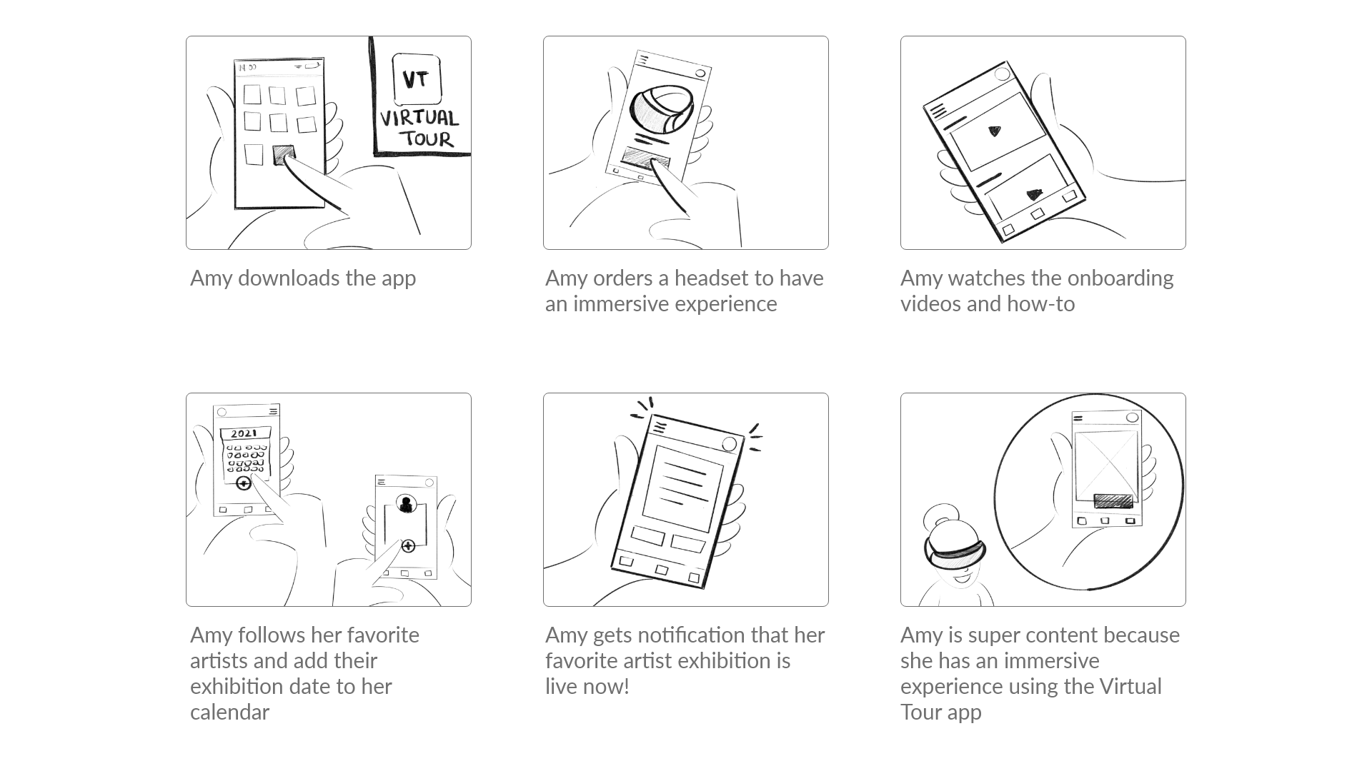
I created a storyboard that visually describes and explores users' experiences to help find potential solutions to users' pain points.
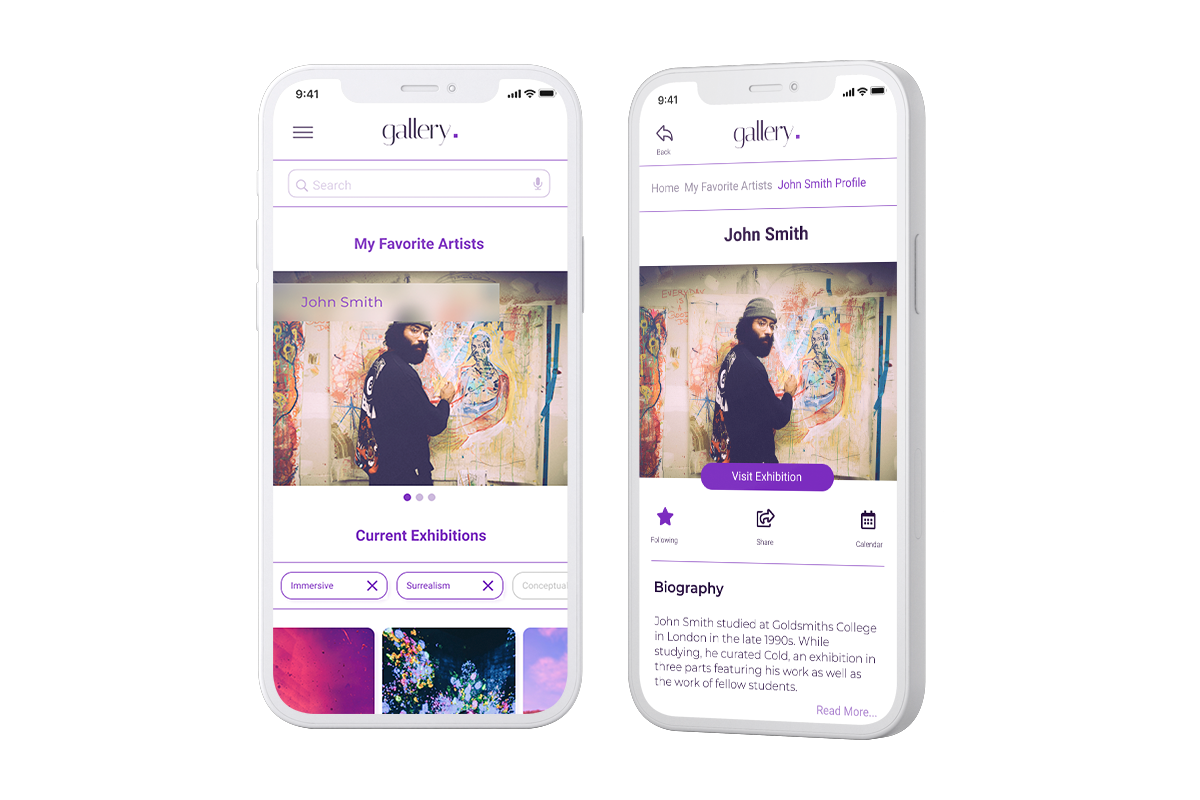
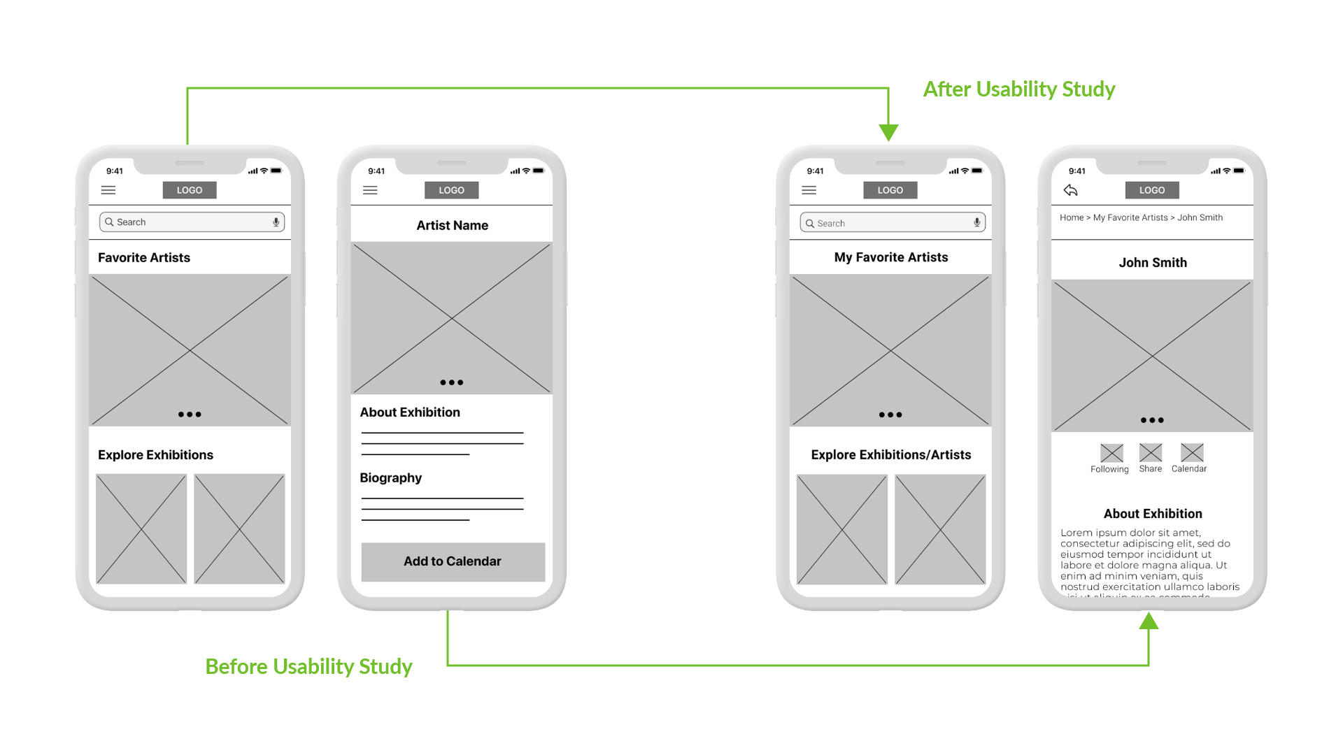
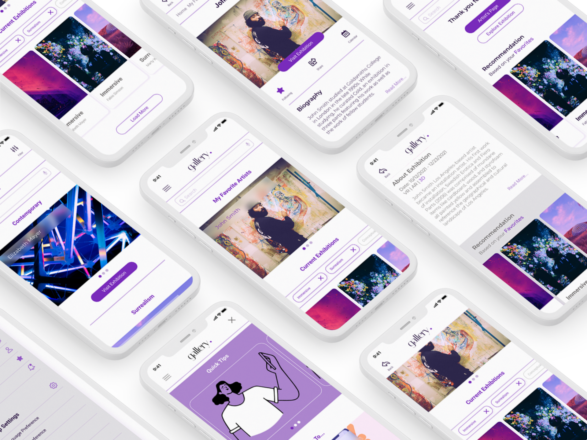
I drafted iterations of each screen on paper. Then, I ensured that the elements that made it to digital wireframes addressed user pain points. For example, I prioritized quick and easy access to artists' exhibits for the home screen.
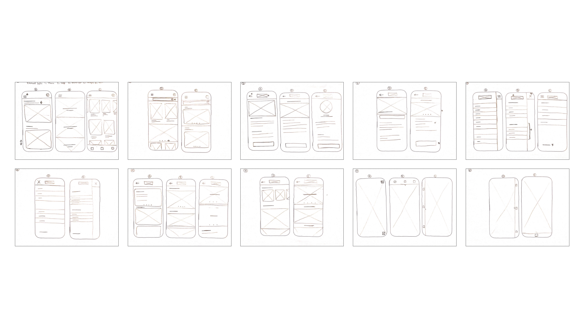
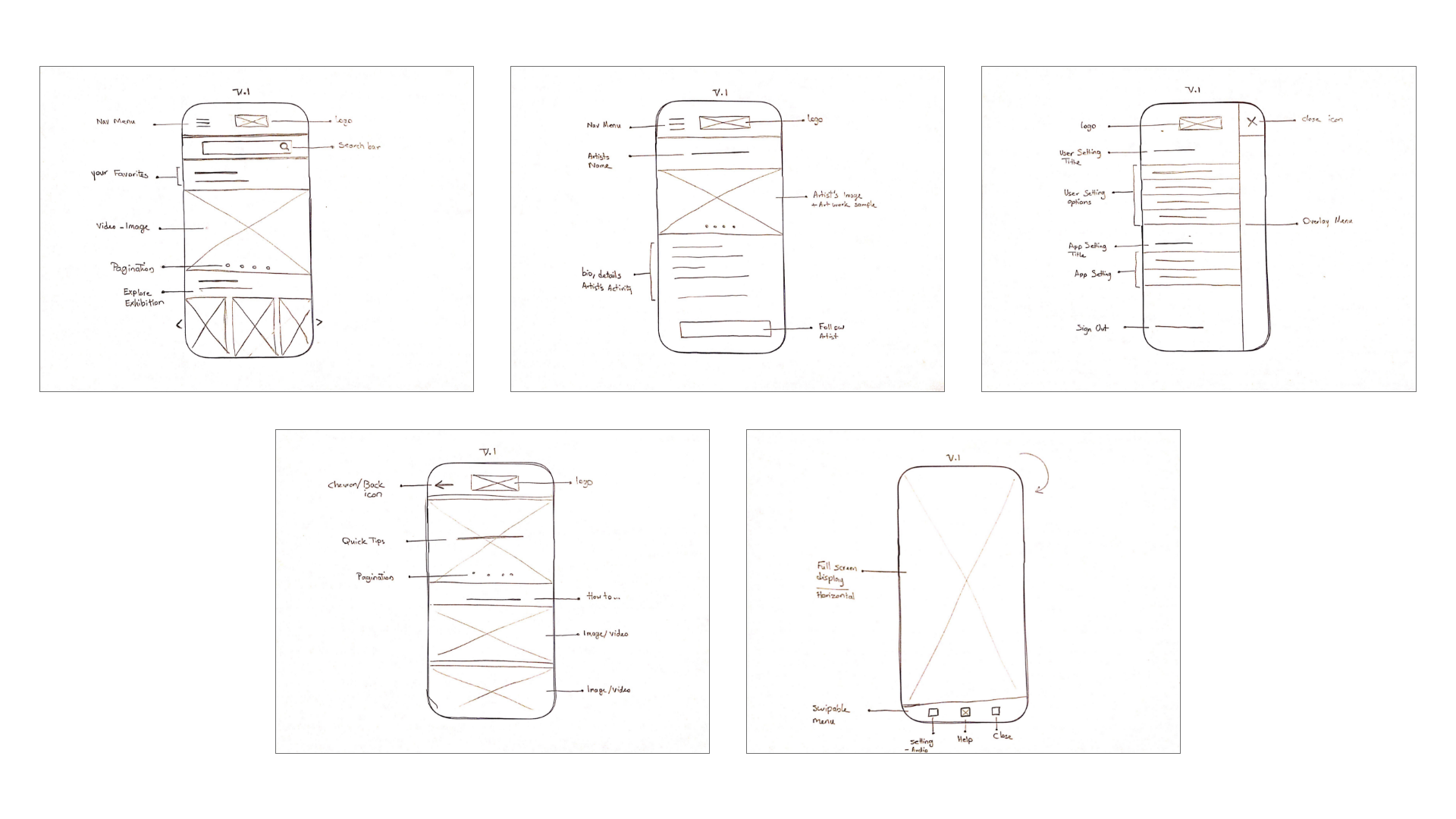
As the initial design phase continued, I ensured designs addressed users' needs. In addition, I implemented the feedback and findings from the user research.
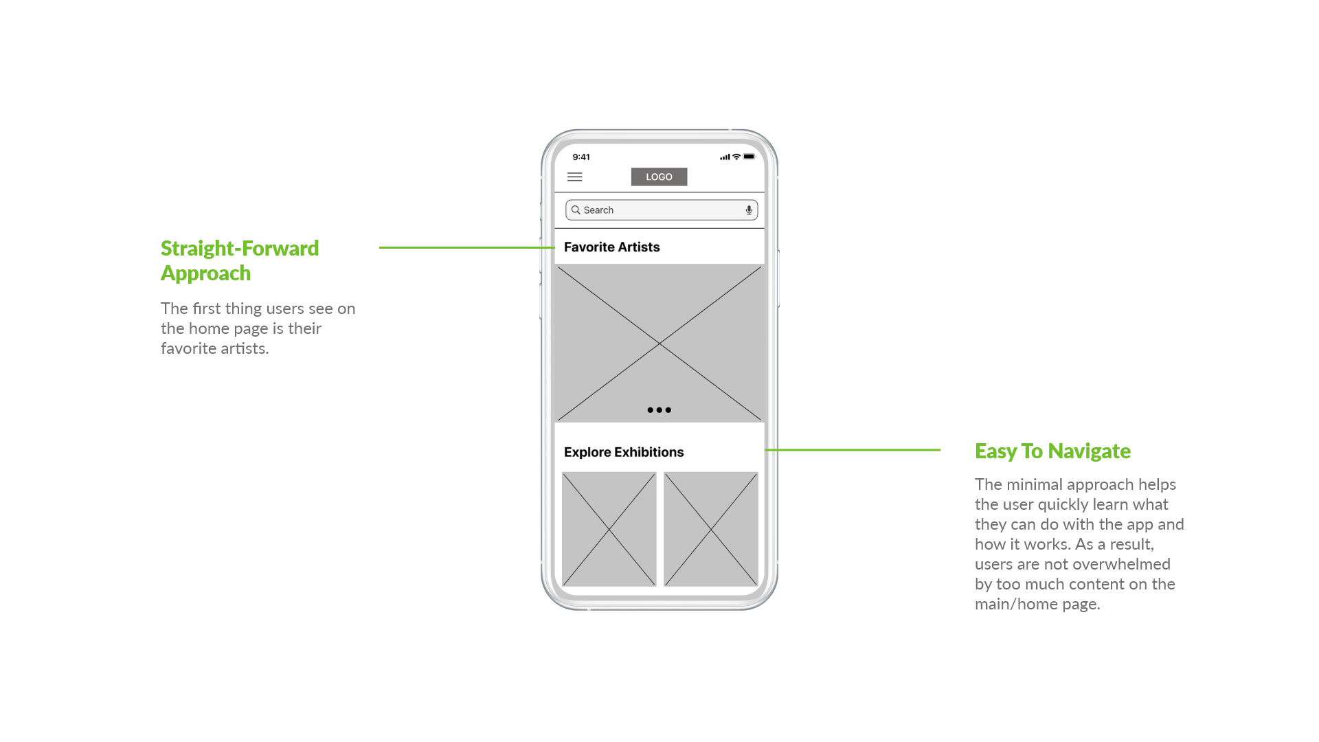
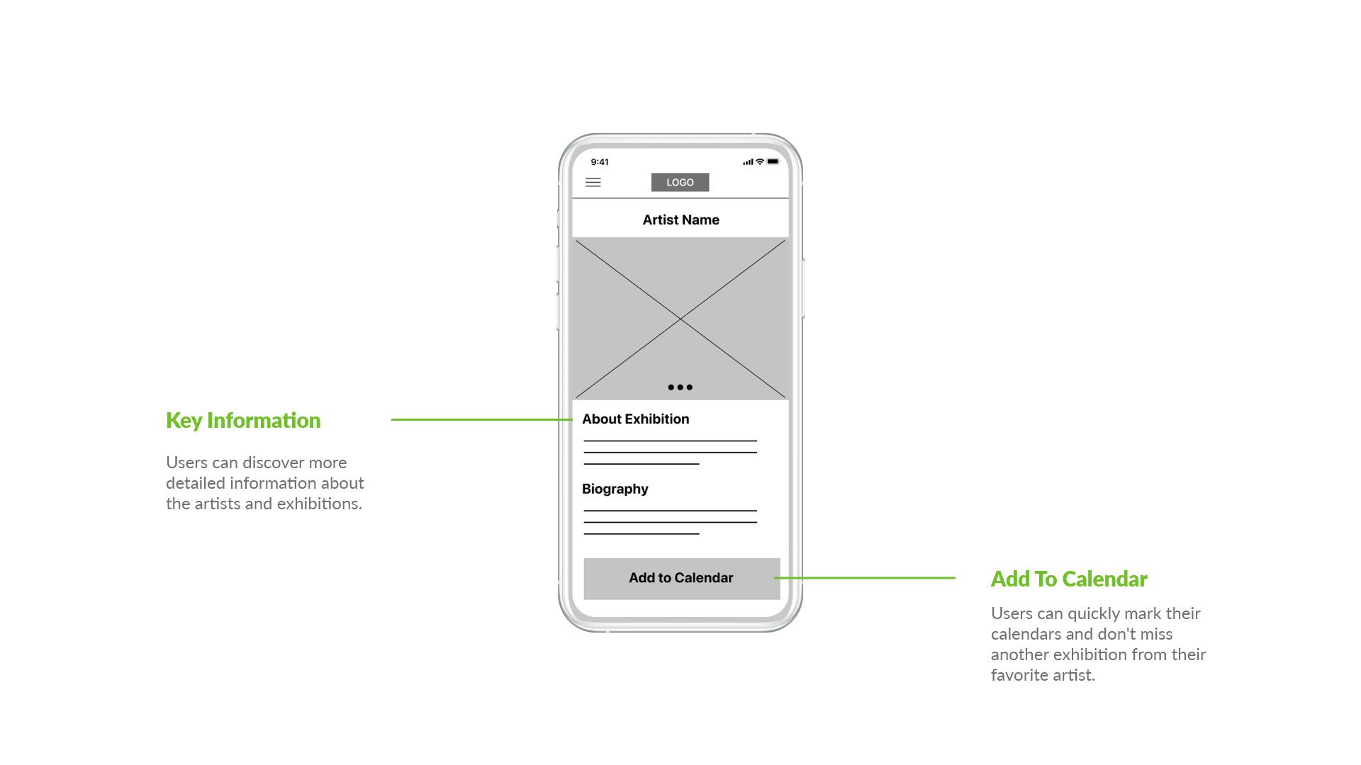
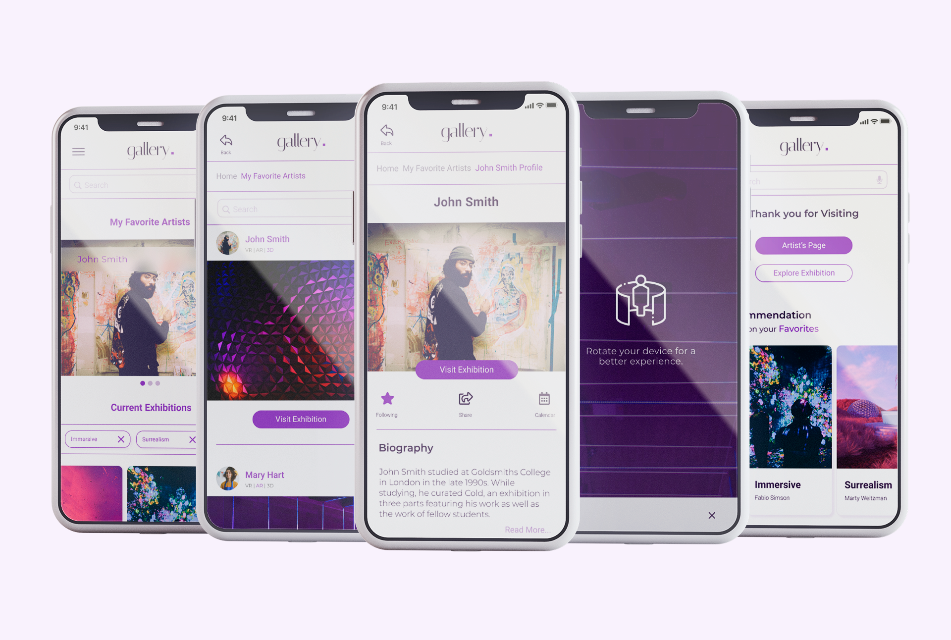
Users access detailed information about artists, exhibitions, dates, and durations. Users are also able to share and mark the calendar.
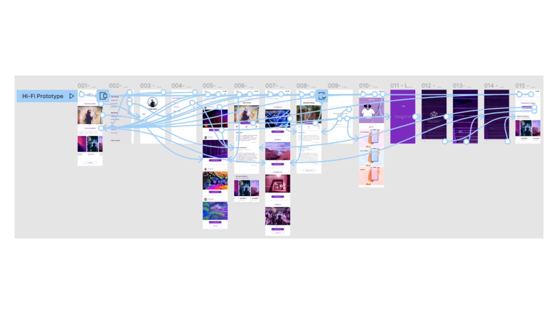
Using the completed set of digital wireframes, I created a low-fidelity prototype. The primary user flow I connected was visiting a favorite artist exhibition.
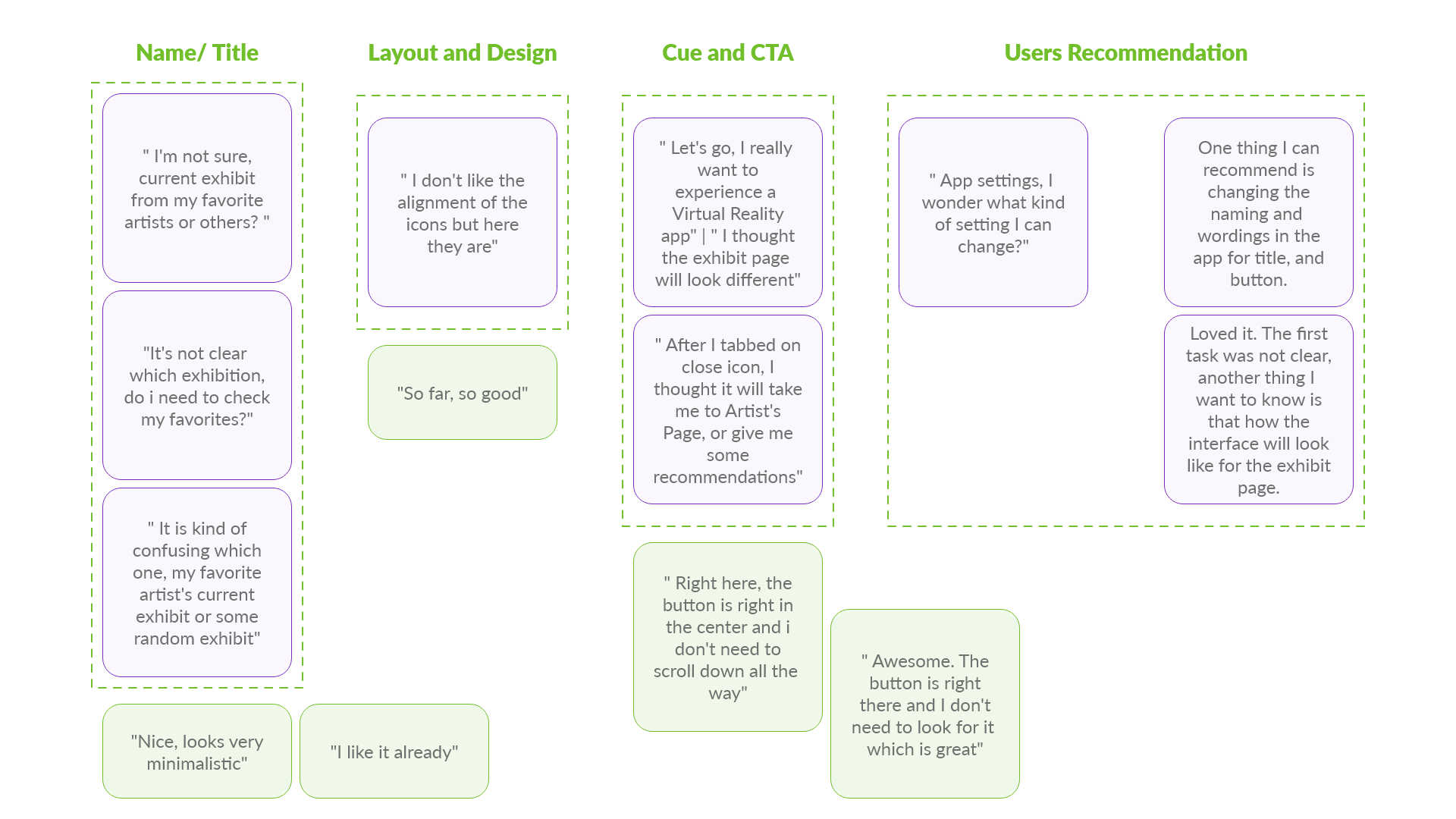
I conducted two rounds of usability studies. Findings from the first study helped guide the designs from wireframes to mockups. For the second study, I used a high-fidelity prototype. The study revealed what aspects of the mockups needed refining.
1. Users need clear, designated icons and CTAs.
2. Users need front and center CTAs without extra steps.
3. Users need familiar visual elements to help them understand the functionality.
1. Users need to see straightforward naming, titles, and copy.
2. Users need a cue after they finish the main user-flow.
After the usability study, I created an affinity map to gather all my notes and observation into groups.
Right after I modified the layout of the early designs based on the findings and user’s feedback.
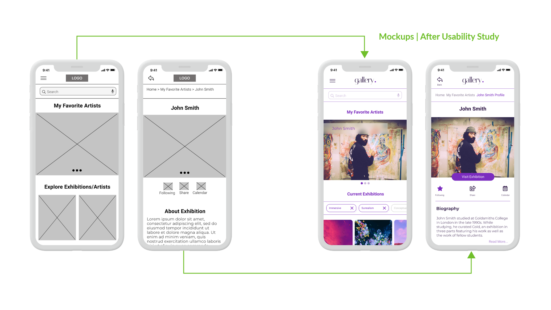
I revised the design a few times and explored different options for a better experience. However, I kept the iterations minimalistic and straightforward without compromising the app's users' experience.
I implemented the insights from the second usability study and made some changes. As a result, the final high-fidelity prototype presented cleaner user flows. It also meets user needs and expectations.
View Virtual Tour App High-Fidelity Prototype
1. I provided alt-text for vision-impaired users who use screen readers.
2. I used icons to help make navigation easier.
3. I made sure colors and contrasts meet WCAG guidelines.
The app's main feature makes it possible for users to enjoy what they love at any time. A quote from one of our users;
"The experience was intuitive. The minimalistic look and feel made it easy for me to complete these tasks. I see myself using this app!"
I learned the importance of inclusivity and accessibility in design. Each usability study and user’s valuable feedback influenced iterations of the designs.
1. Conduct a usability study after launch to confirm whether we addressed the users' pain points.
2. Conduct more user research to determine any new areas of need.
3. Design an interface for users with Virtual Reality devices.
Fill in the form to contact me or send an email to shana.safarzadeh@gmail.com

